Liquidity Evaluation and Checklist for Web3


Introduction
Operating on the principle of "Don't trust, but verify," we at Enflux recognize the challenges that arise from the lack of transparency in the performance of many market makers. Having an immediate and easy-to-understand view of market data is important for evaluating how well market makers are performing and measuring liquidity.
Findings indicate that poor performance by market makers can result in less than ideal liquidity, which can then slow down the acceptance of projects. It is not enough to simply understand liquidity; the ability to verify market maker performance and track market evolution over time is essential.
To this end, we at Enflux have developed a comprehensive dashboard tool. This tool provides real-time metrics and visualizations that shed light on market dynamics. This document will guide you through each dashboard feature, explaining its importance, its interpretation, and what denotes a healthy market that allows traders and investors to adopt the project.
Checklist for Evaluating Liquidity
1. Spread:
- The general spread should ideally be within 0.75% for small-cap projects and within 0.55%for mid-cap projects.
- The chart should exhibit a consistent spread.
- The discrepancy between the effective spread and the best spread should not exceed 0.15%.
2. Depth:
- The bid and ask liquidity should generally exceed $1000 within a 2% range for small-cap projects and $2500 for mid-cap projects.
- The liquidity should exhibit general consistency.
3. Order Levels:
- There should ideally be a minimum of 15 order levels within a 2% range of the price.
- Each order level should have at least some orders.
4. Trade Slippage:
- Most trades should occur within a 0.5% slippage for small-cap projects and 0.3% slippage for mid-cap projects.
- Trades occurring above the 1% slippage threshold should be rare or non-existent.
5. Chart Investigation:
- The chart should not display large wicks, indicating significant price fluctuations.
Spread
The spread, representing the percentage variance between the optimal bid and ask, is a primary determinant of immediate trade execution costs. A narrow spread tends to enhance project adoption and typically amplifies 24-hour trading volume by lowering the immediate loss in value of the trader/investor.
Effective Spread
Traditional spread measure can be manipulated as it disregards the size of the first bid and ask. Market makers might place a minuscule bid and ask closely together, thereby creating an illusion of a tight spread, while the subsequent significant order could be markedly deeper in the book.

Recognizing this, it is essential to consider the 'effective spread', which filters out the initial $100 on both bid and ask sides before recalculating the spread percentage. This approach mitigates the impact of"dust orders," providing a more representative and equitable view of the spread, especially relevant for traders executing orders larger than nominal amounts. The effective spread could thus be seen more as a “real spread”.
Key Spread Metrics
- General Spread: The upper limit for an acceptable spread is typically 0.75% for small-cap projects and 0.55% for mid-cap projects. This is not a strict guideline, but a boundary for what is considered acceptable. A narrower spread provides more favorable trading conditions, reducing immediate asset value loss upon purchase.
- Chart Consistency: In chart analysis, the focus is on the average spread and its general consistency. For instance, a chart may display a consistent average spread of 0.3%, but an inconsistent effective spread ranging from 0.3% to 2%. A consistent spread is crucial as it indicates market health, thereby enhancing trader and investor confidence. Despite this, 100% consistency is not expected.Market makers often widen the spread in response to market volatility as a capital protection strategy.
- Spread Discrepancy: The effective spread and the best spread should ideally not differ by more than 0.15%. A larger effective spread suggests small initial bid and ask order sizes, which could hint at potential spread manipulation. This could result in trading conditions remaining unfavorable despite seemingly tight spreads.
Depth
The order book, alongside the spread, is a vital metric that we consistently monitor. It provides an indication of the tradeable order sizes in a market, as well as the ease with which large traders can enter or exit the market. The depth of the order book is of particular significance because, if insufficient, it could lead to users paying a substantial premium when transacting with large order sizes. Consequently, if this premium is excessively high, users may be discouraged from engaging in such transactions.

In our computation of order book depth metrics, we consider five specific depth levels. These include the 0.5%, 1%, 2%, 5%, and 10% levels.
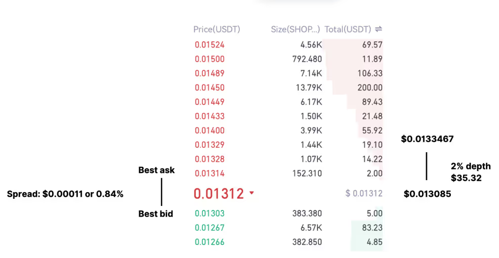
As illustrated in the provided image, we see a midpoint price of $0.013085. The price that is 2% higher than the midpoint price is $0.0133467. To gain insight into the market structure, we tally the number of order levels situated between these two prices, which in this case, totals three order levels.
Furthermore, we calculate the depth of the order book within these levels. In the example given, this comes out to be $35.32 on the ask side, within the 2% mark.
Order Book Depth
The following chart provides a clearer visualization of the bid depth (depicted in green), the ask depth (in red), and the ratio between the two compared to its predecessor.
Upon examining this chart, we note that the 2% bid depth decreases significantly from approximately $2500 to around $600. Meanwhile, the ask (or sell) liquidity fluctuates between $1000 and $300.
Towards the end of this specified time period, we notice an ask depth of roughly $1000. This implies that if a buyer transacts with a size of $1000, they could incur a premium of up to 2% for the acquisition of the asset.

Key Depth Metrics
Our analysis of these charts primarily focuses on two critical measures: Availability and Consistency.
- Availability: This refers to the general depth of the market in dollars at a specific level. The question we aim to answer is - is there typically more than $1000 in bid and ask liquidity within a 2% range for small-cap projects, and $2500 for mid-cap projects?
- Consistency: This measure assesses the steadiness of the liquidity. We question - is the liquidity generally consistent, or are there abrupt fluctuations in liquidity levels?
Order Levels
The ensuing chart presents a stacked bar chart on the left, representing the order book counts within certain depths for both the bid and ask categories separately. The legend clarifies which part of the bar chart corresponds to which depth level.
From the bid order book, as we approach the end of the period, we observe approximately 2 or 3 order levels within the mid-price and 0.5% below the mid-price, and 10 within 5%. In total, there are about 23 order levels (as shown at the top of the bar chart) within the mid-price and 10% below the mid-price.

Key Order Level Metrics
- Density: Are there at least 15 order levels within 2% of the price? It's preferable to have multiple orders contributing to liquidity rather than a single order of equivalent volume. If the single order level is completely filled or cancelled by the user, it leaves a substantial gap in the order book, leading to less favorable trading conditions for the users.
- Continuity: Does each order level contain some orders? Occasionally, we notice orders within 0.5%, and some within 1% of the order book, but no individual orders between 1% and 2% of the order book. This discontinuity results in a large gap in the order book, potentially creating unfavorable trading conditions for the users.
Slippage
The trade slippage metric encapsulates the essence of liquidity quality. It is calculated by finding the percentage difference between the executed trade price and the last recorded mid-price for all public trades.
For instance, if a public buy trade is executed at $1.01 and the last recorded mid-price was $1.00, it indicates that the trade experienced a 1% slippage. Similarly, if a public sell trade takes place at $0.99 while the last mid-price remains at $1.00, this trade also experiences a 1% slippage.
The degree of trade slippage is influenced by several factors. Firstly, the spread establishes the minimum slippage on a trade, since any buyer or seller must first traverse the book (pay the spread) to have their trade executed. Secondly, the depth of the order book impacts slippage, as larger order sizes are more likely to consume multiple order levels, thus increasing slippage. A more profound order book implies that larger trades can be completed at a price closer to the mid-price, thereby reducing slippage.
The third factor is the size of the trades. Given the same liquidity conditions (spread and depth), larger trade sizes result in more slippage. However, a relationship exists between liquidity and order sizes: superior liquidity makes it more appealing for users to trade in larger order sizes.
We posit that slippage is a byproduct of maintaining a narrow spread and a deep order book (0.5%, 0.1%, 0.2% depth, etc.), providing a comprehensive reflection of liquidity quality.

The chart displayed above presents the slippage of all public trades during a given time period, formatted as a histogram. In this representation, we focus solely on the count of trades that occur at a specific slippage level, excluding the volume traded.
For instance, it can be observed from the subsequent chart that the majority of trades transpire within a slippage of 0.24%, with some occurring at a slippage of 0.96%.
Key Slippage Metrics
- Concentration: Are the majority of trades occurring within a 0.5% slippage for small-cap projects and within a 0.3% slippage for mid-cap projects?
- Extremes: Are there any trades taking place above the 1% slippage level?
Chart Investigation
To create a candlestick chart, we compile all public trades and calculate the open, highest, lowest, and last (close) trade prices within a specific candlestick timeframe. Similar to the trade slippage charts, the candlestick chart offers a summary of liquidity quality. Traders may use this chart to determine if a token appears sufficiently appealing to purchase. Large wicks, for instance, may deter traders from transacting in the token.

Key Chart Metrics
- Presence of Large Wicks: Does the chart exhibit large wicks? A chart featuring large wicks indicates that slippage may have occurred on the exchange, which could be an outcome of a market lacking liquidity.
Last Words
We place a high value on transparency, which is why we offer these assessments at no cost. This involves monitoring your markets and providing a 5-10 minute explanatory video where we dissect your market dynamics.
Our clients, on the other hand, will receive these dashboards free of charge. This allows them to assess our performance and gain a deeper understanding of their markets.
If you're interested in having us evaluate your market's liquidity, please let us know by reaching out on the "Contact Us" section.


